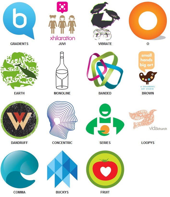
Logo Design Trends 2011 from @logolounge
The 2011 logo design trends report has just been released courtesy of the fine people at LogoLounge.
It’s always interesting to peruse the report for recent logo fads – if not at least to see whether oneself has been guilty of following any.

I found this comment from the report summary particularly interesting:
It feels like what people believe a logo to be is also becoming more transcendent. A logo is no longer a single piece of flat art. It can be a favicon, an icon, or an entire set of marks that work together to support the team. Its boundaries have become less strict as well. There was a time when most logos could be enclosed in a simple hand-drawn square, circle or similar geometric shape, but now many logos drag outside those outlines. They just don’t want to fit the old mold.
As a brand identity designer this makes complete sense. Increasingly clients are requiring a more complex approach to defining their brand than a traditional flat logo can offer. Dynamic identity systems are becoming much more prevalent, and as the demand for them grows, the notion of what a logo ‘should’ look like will continue to shift.
What do you think? Do you recognize any of the logo trends in the report?