Nazi Graphics Standards Manual


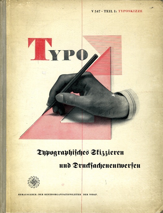
Steven Heller of Design Observer tracked down this rare Nazi graphics standards manual.
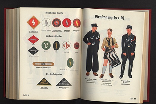
Designers and design historians told me over the years that they had heard about the existence of a Nazi graphics standards manual. No one could say they actually saw it, but they knew of someone who had. So it grew into something of a Big Foot or Loch Ness Monster tale, until one day I actually saw it too – and it had been right under my nose the whole time.
I had envisioned a manual of the kind that Lester Beall did for International Paper or Paul Rand did for IBM, showing acceptable logo weights and sizes, corporate typefaces and colors. I was so familiar with these standards manuals, that it never even occurred to me they were postwar formats — and decidedly modern. Maybe the Nazis did theirs in a different way.
Wow.
Image and article source: Design Observer and Imjustcreative.