Steve Shanabruch loves design and his home of Chicago. Bringing together these two passions, he’s launched The Chicago Neighbourhoods – One designers take on Chicago.
Steve plans to design a few logos a week until he has covered all 77 community areas of Chicago.
I’m looking forward to seeing how this project progresses. You can track The Chicago Neighbourhoods on both Twitter and Facebook.
If you dig this project, you may also be interested in checking out Branding 10,000 Lakes.… Read more

If you don’t live in London, will never visit London, and/or you have no interest in burgers or iPhone apps, you may want to tune out now.
Two months have past since we released our first iPhone app, Best Sandwiches London. Almost immediately after launch sales of the app took off, initially boosted by an article on The Next Web, then propelled forward by the app getting featured in both the New and Noteworthy and What’s Hot categories of the… Read more

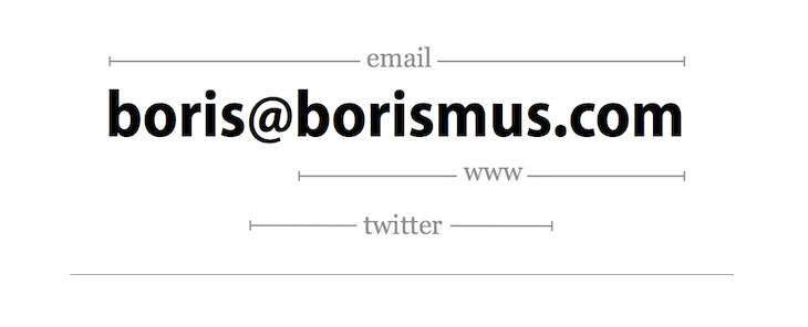
This is Google employee, Boris Smus’ attempt to create the most minimal business card design possible. The concept uses his email address to uncover his first name, last name, website and twitter account.
I’m not convinced this method would be effective for everybody, but I admire his approach in fitting as much information as possible within a constrained space.
What do you think?
(Via Kottke)
####
Stay in the loop
To stay updated on our projects & cool finds on… Read more

If you don’t live in London, will never visit London, and/or you have no interest in sandwiches or iPhone apps, you may want to tune out now.
Admittedly, things on the blogging front have been a bit quieter than usual recently. The main reason being that behind the scenes we’ve never been busier. Whilst juggling a couple of branding projects, we have also been designing our very first iPhone app. The app is called Best Sandwiches London and is now… Read more

Brand guidelines don’t get much more geek-cool than this.
Via Blair Thomson.… Read more

By now, you probably know that I’ve got a bit of a ‘thing’ for vintage logos and branding. As you can see here, here, and here.
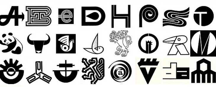
Just when I thought I’d seen every possible collection available on the web, I stumbled across this lovely Flickr set, featuring logos from a mid-70’s edition of the World Book of Logotypes.
Lovely.
Thanks Coudal.… Read more

This stunning collection of vintage logos (1950s to 1960s) came to my attention via the always interesting, Aqua Velvet.
These vintage Japanese logos really really caught my eye.
Expo ’70 Osaka Logo
Kokusai International Travel Logo
There are plenty more where they came from, so be sure to check out the complete Flickr set.
Also, if you are a fan of vintage logos, Retro Logo Goodness and Scandinavian Logos from the 60s and 70s may be of interest… Read more

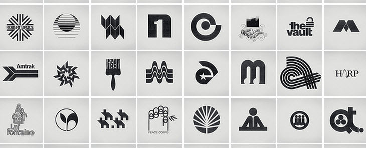
Just stumbled across this outstanding Flickr set titled, Retro Logo Goodness — a study in retro/vintage logos.
Nothing like a bit of logo porn to cap off a busy week. Enjoy!
See the full Flickr set here.
Source: Coudal… Read more

Every now and then I like to throw an opinion out there on Facebook or Twitter, and gauge the reaction from my followers.
Sometimes they agree, sometimes they disagree, but it always helps me to achieve some perspective on a particular issue.
A few weeks ago, I sent out this Facebook post:
While I admit the post was a tad melodramatic, I stand by it. In my opinion, Google AdSense has no place on a design blog. It’s spammy, kills… Read more

Whether you are doing it solo as a freelance designer, or run your own design studio, your chances of success are pretty slim unless you learn to manage client relationships properly.
I have been running my own design business for around 2.5 years now, and while I don’t pretend I know everything, there are a few tricks I have picked up along the way.
In this post, I will be sharing 15 rapid-fire bits of advice on how to manage… Read more

While I have experienced both successes and failures as a designer, one thing is for sure, I have certainly learnt a lot along the way. To impart some of this knowledge, in this post, you will find fifteen useful logo design tips.
1. It all starts with the brief
Okay, this first one is really a given. Building a comprehensive design brief upfront is vital to the success of a logo design project. It will become your point of reference… Read more

Its been nearly 12 months since Logobird was launched. Overall its been a great year with the site steadily growing – completely exceeding my expectations.
Despite doing rather well so far, the time for change had come, and here you have it – the all new Logobird.
This post will give you a rundown on some of the changes to the site and what you can expect from us going forward.
We have switched domains
Firstly, we have ditched our… Read more

A new logo controversy is upon us with the news that the NBC Universal logo has been redesigned – dropping its globe silhouette and iconic Peacock.
The redesign marks the takeover of NBC Universal by media conglomerate Comcast. With the takeover NBC Universal has also been renamed to NBCUniversal.
Old NBC Universal Logo
New NBCUniversal Logo
Before getting all up in arms about the change it is important to note that the iconic NBC network logo (pictured below) will remain… Read more

A new logo for HTML5 has been unveiled by the W3C – the international community responsible for developing standards for the web.
The new logo will primarily act as a badge for web designers and developers, giving them a standardized symbol to inform visitors that parts of HTML5 has been implemented into their site. Important to note however, the logo does not imply validity or conformance with web standards.
The new identity for HTML5 was developed by Honolulu-based Ocupop. Here… Read more

A new Starbucks logo has been unveiled.
“we’ve given her a small but meaningful update to ensure that the Starbucks brand continues to embrace our heritage in ways that are true to our core values and that also ensure we remain relevant and poised for future growth.”
– Howard Schultz, Starbucks president and CEO
A well executed logo redesign
As one of the most recognised brands in the world, this logo redesign is a bold move for Starbucks.
What the… Read more

The new Rio 2016 Summer Olympics logo was unveiled on New Year’s Eve at a Copacabana beach party in Brazil.
According to the official Rio 2016 Olympic games website:
The brand translates the Olympic spirit and the nature, feelings, and aspirations of the athletes, Rio and the cariocas. Different countries, athletes and peoples are joined in a warm embrace – in an individual and collective move, which at a second glance, reveals one of Rio’s most beautiful icons, a vibrant… Read more

It is hard to believe that 2010 is really coming to an end. I would like to take this opportunity to sincerely thank you for your support over the past year. Without it, this blog would not be possible.
As always, below you will find five of my favourite logo and identity design reads for the month.
In no particular order.
Logo and Identity Design Resources December 2010
The People’s Supermarket – via @ID_Designed
A beautifully executed identity system created… Read more

Logo redesign and corporate rebranding is always a challenging, and often controversial undertaking for both the designer and organisation involved.
With the year drawing to a close, I thought it would be useful to take a look back at some of the more successful logo redesigns of 2010.
Disclosure: Each of the logo redesigns featured below were originally profiled on Brand New – one of the best resources for logo and identity design opinion. Please visit Brand New for logo… Read more

Curious to see where other logo and identity designers work, I recently made a call-out to some of my friends and colleagues to submit a photo of their current studio or workspace setup.
Amongst the submissions there are some really inspiring and interesting setups.
Let the voyeurism begin.
Where logo and identity designers work
Sean Farrell (Brand Clay) – Twitter
Graham Smith (Imjustcreative) – Twitter
Pete Lacey (Chopeh) – Twitter
Jacob Cass (Just Creative Design) – Twitter
Leighton Hubbell –… Read more

November is coming to an end (where did the year go?) and it is that time again where I like to share some of the best logo and identity design resources for the month.
In no particular order, here are five of my favourite reads (or links) for the month.
1. Why a bigger logo can harm your brand via IdApostle
Can a logo be too big? You bet. How big is too big. Head over to IdApostle and read… Read more
