Steve Shanabruch loves design and his home of Chicago. Bringing together these two passions, he’s launched The Chicago Neighbourhoods – One designers take on Chicago.
Steve plans to design a few logos a week until he has covered all 77 community areas of Chicago.
I’m looking forward to seeing how this project progresses. You can track The Chicago Neighbourhoods on both Twitter and Facebook.
If you dig this project, you may also be interested in checking out Branding 10,000 Lakes.… Read more

New York-based design firm, COLLINS, has developed a permanent mark to honour 10 years passing since the tragic events of 9/11, 2001.
From honoring911.com:
For us‚ this mark conveys the challenging but eternal lesson of that morning: we are as one. Just as we fall together‚ we can only rise together. Living with such empathy for one another is a steep mountain to climb. But we believe it is both the path out of 9-11 and the path we must… Read more

Brand guidelines don’t get much more geek-cool than this.
Via Blair Thomson.… Read more

By now, you probably know that I’ve got a bit of a ‘thing’ for vintage logos and branding. As you can see here, here, and here.
Just when I thought I’d seen every possible collection available on the web, I stumbled across this lovely Flickr set, featuring logos from a mid-70’s edition of the World Book of Logotypes.
Lovely.
Thanks Coudal.… Read more

Update: Giveaway Winners Announced
Congratulations Bill S Kenney, Keri Thornton, and Matt Yow — a copy of Symbol will be on its way to you shortly.
If you lucked out this time, don’t despair. We’ll be giving away a copy of the limited-run, Codex magazine next week.
Stay tuned!
###
During our move from Australia to London, one unfortunate casualty was our collection of design books. Being heavy, and therefore too expensive to ship, they now sit in storage, gathering… Read more

This stunning collection of vintage logos (1950s to 1960s) came to my attention via the always interesting, Aqua Velvet.
These vintage Japanese logos really really caught my eye.
Expo ’70 Osaka Logo
Kokusai International Travel Logo
There are plenty more where they came from, so be sure to check out the complete Flickr set.
Also, if you are a fan of vintage logos, Retro Logo Goodness and Scandinavian Logos from the 60s and 70s may be of interest… Read more

Just stumbled across this outstanding Flickr set titled, Retro Logo Goodness — a study in retro/vintage logos.
Nothing like a bit of logo porn to cap off a busy week. Enjoy!
See the full Flickr set here.
Source: Coudal… Read more

The 2011 logo design trends report has just been released courtesy of the fine people at LogoLounge.
It’s always interesting to peruse the report for recent logo fads – if not at least to see whether oneself has been guilty of following any.
I found this comment from the report summary particularly interesting:
It feels like what people believe a logo to be is also becoming more transcendent. A logo is no longer a single piece of flat art.… Read more

This is a guest post by Dennis Salvatier, blogger at Tanoshiboy and designer at Salvatier Studios, an award-wining design studio located in Southern California. You can reach Dennis through his website or on Twitter.
Crowdsourcing Won’t Help You
In the last few years crowdsourcing has become the single greatest enemy to design, more so when it comes to logo design. Let’s start off with an explanation about what crowdsourcing is.
This is when a company or an organization offers a… Read more

Every now and then I like to throw an opinion out there on Facebook or Twitter, and gauge the reaction from my followers.
Sometimes they agree, sometimes they disagree, but it always helps me to achieve some perspective on a particular issue.
A few weeks ago, I sent out this Facebook post:
While I admit the post was a tad melodramatic, I stand by it. In my opinion, Google AdSense has no place on a design blog. It’s spammy, kills… Read more

Whether you are doing it solo as a freelance designer, or run your own design studio, your chances of success are pretty slim unless you learn to manage client relationships properly.
I have been running my own design business for around 2.5 years now, and while I don’t pretend I know everything, there are a few tricks I have picked up along the way.
In this post, I will be sharing 15 rapid-fire bits of advice on how to manage… Read more

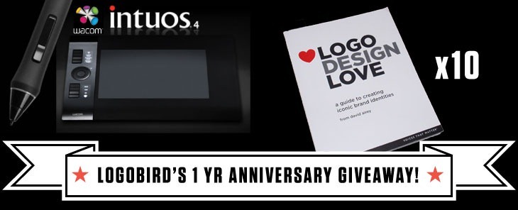
Logobird was officially launched one year ago. Its been a really exciting 12 months for us, with the growth of the site well exceeding all our expectations.
As is almost customary, I could take this opportunity to go into detail about our subscriber stats, achievements, most popular posts, yada yada – but I’m not here to gloat.
The purpose of this post is to give something back. To say ‘thank you’ to our readers and the design community as a… Read more

While I have experienced both successes and failures as a designer, one thing is for sure, I have certainly learnt a lot along the way. To impart some of this knowledge, in this post, you will find fifteen useful logo design tips.
1. It all starts with the brief
Okay, this first one is really a given. Building a comprehensive design brief upfront is vital to the success of a logo design project. It will become your point of reference… Read more

Its been nearly 12 months since Logobird was launched. Overall its been a great year with the site steadily growing – completely exceeding my expectations.
Despite doing rather well so far, the time for change had come, and here you have it – the all new Logobird.
This post will give you a rundown on some of the changes to the site and what you can expect from us going forward.
We have switched domains
Firstly, we have ditched our… Read more

A new logo controversy is upon us with the news that the NBC Universal logo has been redesigned – dropping its globe silhouette and iconic Peacock.
The redesign marks the takeover of NBC Universal by media conglomerate Comcast. With the takeover NBC Universal has also been renamed to NBCUniversal.
Old NBC Universal Logo
New NBCUniversal Logo
Before getting all up in arms about the change it is important to note that the iconic NBC network logo (pictured below) will remain… Read more

A new logo for HTML5 has been unveiled by the W3C – the international community responsible for developing standards for the web.
The new logo will primarily act as a badge for web designers and developers, giving them a standardized symbol to inform visitors that parts of HTML5 has been implemented into their site. Important to note however, the logo does not imply validity or conformance with web standards.
The new identity for HTML5 was developed by Honolulu-based Ocupop. Here… Read more

A new Starbucks logo has been unveiled.
“we’ve given her a small but meaningful update to ensure that the Starbucks brand continues to embrace our heritage in ways that are true to our core values and that also ensure we remain relevant and poised for future growth.”
– Howard Schultz, Starbucks president and CEO
A well executed logo redesign
As one of the most recognised brands in the world, this logo redesign is a bold move for Starbucks.
What the… Read more

The new Rio 2016 Summer Olympics logo was unveiled on New Year’s Eve at a Copacabana beach party in Brazil.
According to the official Rio 2016 Olympic games website:
The brand translates the Olympic spirit and the nature, feelings, and aspirations of the athletes, Rio and the cariocas. Different countries, athletes and peoples are joined in a warm embrace – in an individual and collective move, which at a second glance, reveals one of Rio’s most beautiful icons, a vibrant… Read more

It is hard to believe that 2010 is really coming to an end. I would like to take this opportunity to sincerely thank you for your support over the past year. Without it, this blog would not be possible.
As always, below you will find five of my favourite logo and identity design reads for the month.
In no particular order.
Logo and Identity Design Resources December 2010
The People’s Supermarket – via @ID_Designed
A beautifully executed identity system created… Read more

Logo redesign and corporate rebranding is always a challenging, and often controversial undertaking for both the designer and organisation involved.
With the year drawing to a close, I thought it would be useful to take a look back at some of the more successful logo redesigns of 2010.
Disclosure: Each of the logo redesigns featured below were originally profiled on Brand New – one of the best resources for logo and identity design opinion. Please visit Brand New for logo… Read more
