Symbol Book Review and Giveaway
Update: Giveaway Winners Announced
Congratulations Bill S Kenney, Keri Thornton, and Matt Yow — a copy of Symbol will be on its way to you shortly.
If you lucked out this time, don’t despair. We’ll be giving away a copy of the limited-run, Codex magazine next week.
Stay tuned!
###
During our move from Australia to London, one unfortunate casualty was our collection of design books. Being heavy, and therefore too expensive to ship, they now sit in storage, gathering dust until we return sometime in the future.
Now that we have finally settled into our new studio in London, I have the pleasure of starting a new book collection.
To kick-start the collection, my first purchase was the new book, Symbol by Angus Hyland and Steven Bateman.
Please read on for a brief review of Symbol, and to find out how you can win yourself a copy.
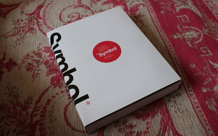
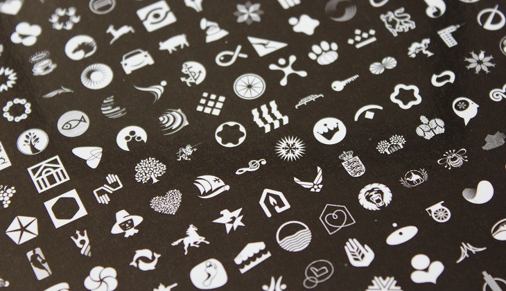
From the preface: “The idea behind the book is to explore the visual language of symbols according to its most basic element: form.”
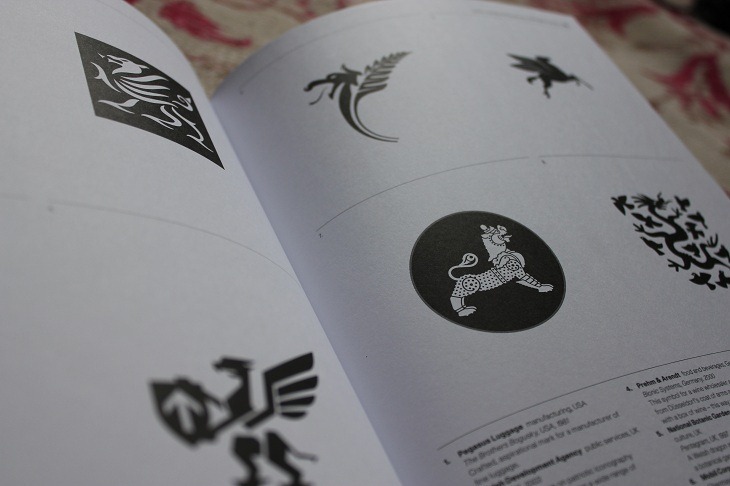
To achieve this, the authors have compiled 1300+ symbols from all over the world, from different times and purposes, and have categorised them simply by visual type — abstract and representational. Within those categories they have broken the symbols down into smaller subsets, for example; circles, polygons, trees, architecture, etc. The aim being to strip the symbols of their associated meanings, so that the viewer can assess the “effectiveness of their composition.”
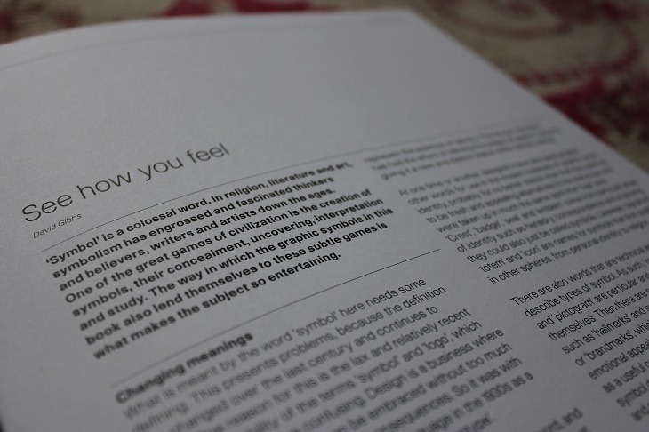
The book starts with a 5 page introduction, giving some background on the meaning of different symbols, and also the role they play in branding and corporate identity. It’s very informative, but reads a little too much like a text book for my liking. It could just be that I have a short attention span, so don’t let that deter you too much.
The introduction does contain a brilliant quote by Alan Fletcher (Reuters and Victoria and Albert Museum identity designer):
Commercial symbols are like people. Some are reasonably put together but lack personality, others are aggressive, or pompous, or merely unpleasant. Occasionally one encounters an interesting character. Whatever the case, to be effective, a trademark must meet a set of criteria: the utilitarian values of being relevant, appropriate and practical and the intangible qualities of being memorable and distinctive; and that something extra, the visual tweak which creates a unique personality.
Wise words, from a very wise man.
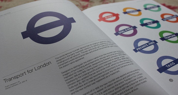
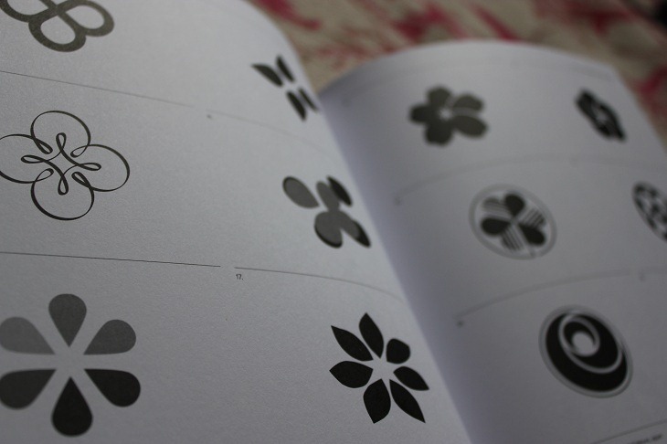
The layout of the book is excellent – it’s a visual delight actually. Simple, clean and straight to the point.
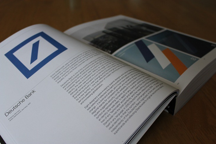
Punctuating each subsection of the book is a brief case study, which provides a more in-depth look at how a particular symbol came to be.
Case studies include: Transport for London (above), Deutsche Bank (above), Continental Airlines, Nike, Munich Olympics (below), Apple, Shell, and CBS, just to name a few.
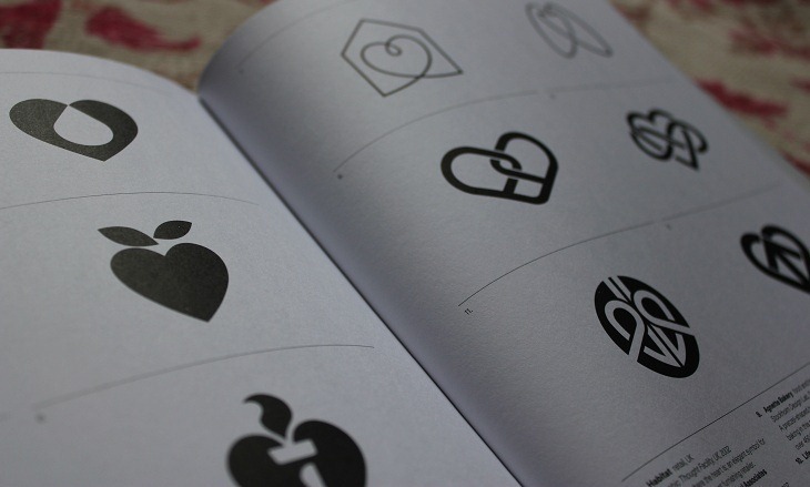
As the symbols have been disassociated from their meaning, it challenges the reader to interpret each symbol for what it is. It makes you think, which is something that I particularly enjoyed.
Each symbol is also indexed by a number, referencing basic information such as: designer, country, year created and a brief description.
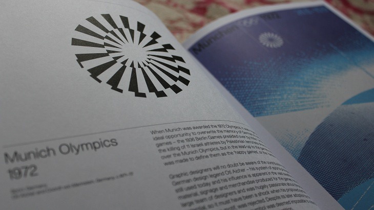
Overall, Symbol is an excellent book that I can highly recommend for anyone interested in brand identity design.
It’s comprehensive, informative, and is a book that you will go back to over the years for inspiration.
A worthy addtion to any designers library.
In conclusion, buy it.
Symbol Book Giveaway
I loved this book so much that I have decided to give away 3 copies to our readers.
To enter the giveaway, all you need to do is leave a comment below and retweet this post.
Also, if you haven’t already, please also sign up for free updates via email/RSS, and Like Logobird on Facebook.
Winners will be announced next Friday, 17th June 2011.
Good luck!