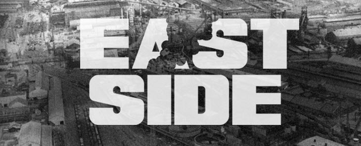
Steve Shanabruch loves design and his home of Chicago. Bringing together these two passions, he’s launched The Chicago Neighbourhoods – One designers take on Chicago.
Steve plans to design a few logos a week until he has covered all 77 community areas of Chicago.
I’m looking forward to seeing how this project progresses. You can track The Chicago Neighbourhoods on both Twitter and Facebook.
If you dig this project, you may also be interested in checking out Branding 10,000 Lakes.… Read more
Really digging the identity for Great British Chefs by London-based studio Hat-Trick. The way they have developed the C-shaped logo around different kitchen utensils is brilliant. Very well executed.
The Great British Chefs brand is centered around a new iPhone and iPad app. The app features videos, cooking techniques, and recipes from 12 of Britain’s best Michelin-stared chefs.
Source: Richard Baird.… Read more

Update: Giveaway Winners Announced
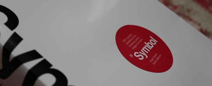
Congratulations Bill S Kenney, Keri Thornton, and Matt Yow — a copy of Symbol will be on its way to you shortly.
If you lucked out this time, don’t despair. We’ll be giving away a copy of the limited-run, Codex magazine next week.
Stay tuned!
###
During our move from Australia to London, one unfortunate casualty was our collection of design books. Being heavy, and therefore too expensive to ship, they now sit in storage, gathering… Read more
If, like me, you missed the update to Heineken’s visual identity last year, this short video will bring you up to speed.
The presentation really underlines the fact that often subtle changes are the most effective.
Hat tip to Jacob Cass via Twitter.… Read more

The 2011 logo design trends report has just been released courtesy of the fine people at LogoLounge.
It’s always interesting to peruse the report for recent logo fads – if not at least to see whether oneself has been guilty of following any.
I found this comment from the report summary particularly interesting:
It feels like what people believe a logo to be is also becoming more transcendent. A logo is no longer a single piece of flat art.… Read more
Eurostar, the high speed train service that runs between London and greater Europe, is getting an ambitious new logo and identity system courtesy of London-based SomeOne.
At the core of the Eurostar rebrand is a three dimensional logo based on an actual sculpture originally designed in CAD program Maya, then built as a physical 3 meter prototype.
Custom pictograms were developed to help guide international passengers on the service.
A custom typeface was created to complement the visual identity.… Read more
Taking dynamic identities to the extreme, MIT Media Lab gets a fresh new logo, with no less than 40,000 variations.
The identity system was designed by Brooklyn-based Richard The. Here is an except explaining his reasoning behind the logo:
The logo is based on a visual system, an algorithm that produces a unique logo for each person, for faculty, staff and students. Each person can claim and own an individual shape and can use it on their business card a… Read more
Mexico-based branding agency, Anagrama just unveiled some superb new identity work.
Just goes to show that real estate branding doesn’t need to be boring. Absolutely stunning use of colour.
Head over to their site to check out the full project details.
Source: Anagrama… Read more

A new Starbucks logo has been unveiled.
“we’ve given her a small but meaningful update to ensure that the Starbucks brand continues to embrace our heritage in ways that are true to our core values and that also ensure we remain relevant and poised for future growth.”
– Howard Schultz, Starbucks president and CEO
A well executed logo redesign
As one of the most recognised brands in the world, this logo redesign is a bold move for Starbucks.
What the… Read more
Page 1 of 11
